

An improved information architecture to help restructure the LinkedIn Premium for better content discoverability and to improve the user interaction with LinkedIn Premium features.
Intent:
Interaction Design and Information Architecture coursework
Role:
Information Architect
Tools:
Figma, Sketch, Optimal Sort
Duration:
10 weeks
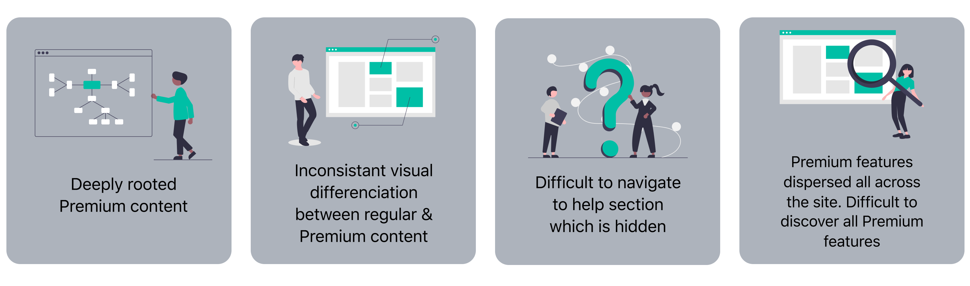
I chose LinkedIn because of my personal experience of using LinkedIn Premium for Job Seekers. Most of the exclusive premium features were spread across various tasks that a user could perform on the platform. I found that there wasn’t a clear differentiation between regular tasks and premium offerings, except for a golden color small callout of a premium feature, which was easy to miss. Navigating to various premium features was challenging and even worse, the help section was deeply rooted and almost hidden.
The existing navigation patterns and hidden menus of Premium content & features make LinkedIn's Premium for Job Seekers an unpleasant experience for the premium members.
To validate my assumptions, I decided to quickly reach out to a few other users to get their views.
Their views resonated with mine. Some of their comments were:
“There are too many options and some of them aren't placed where I did expect them to be”
“I honestly am not aware of all the features available. I know I can see insights about jobs I apply to - that’s about it, as well as InMail.”
“I'm probably not aware of all of them but I believe it's hard to find information on LinkedIn as it stands. I feel as if LinkedIn overwhelms the user with very granular options”
The existing navigation patterns and hidden menus of Premium content & features make LinkedIn's Premium for Job Seekers an unpleasant experience for the premium members.
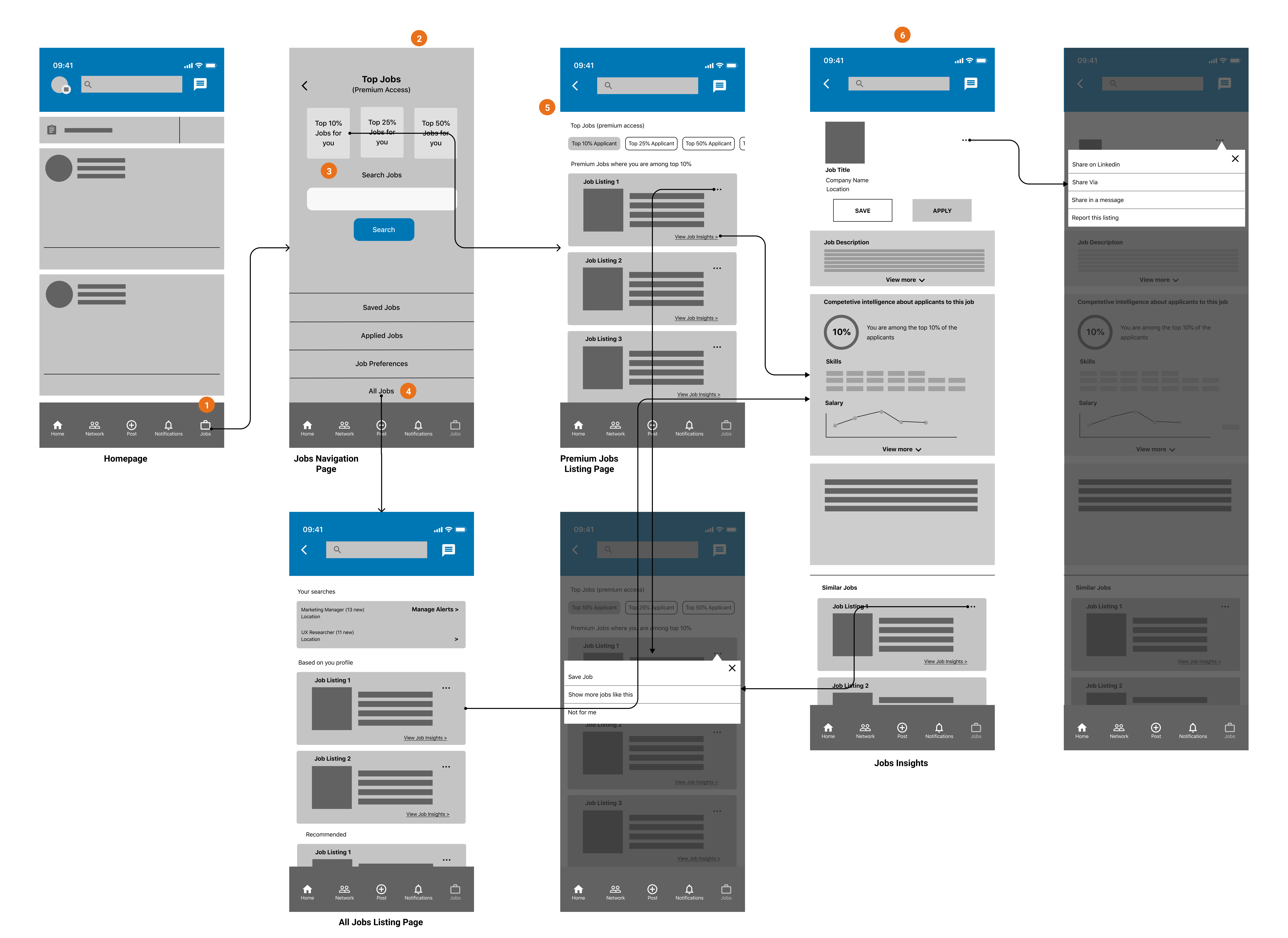
View the job insights of any job of your choice to which you are among the top 10% of the applicants
Steps–
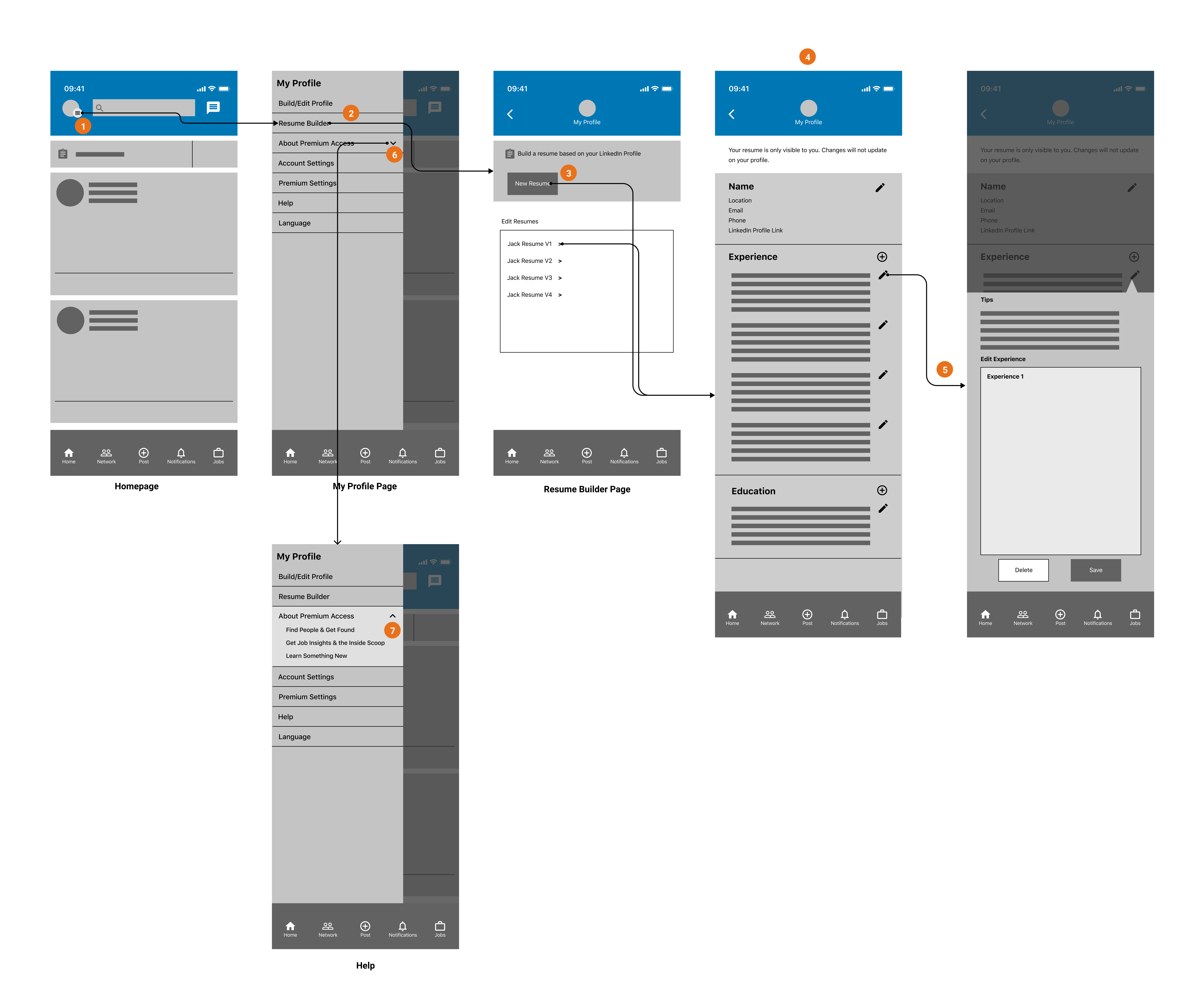
Create your resume using the resume builder tool
Steps–
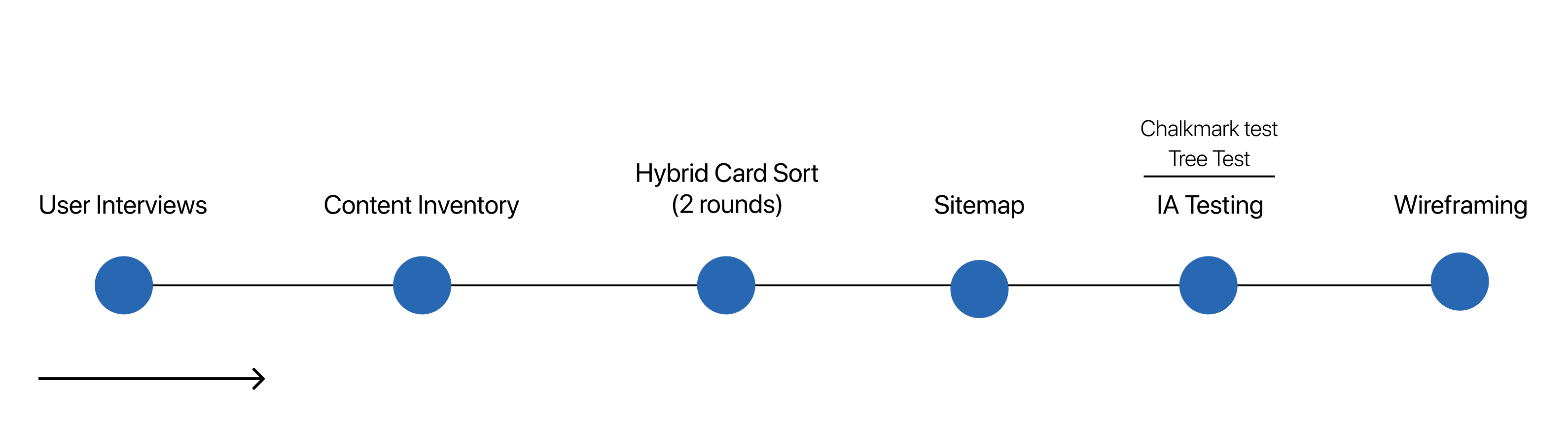
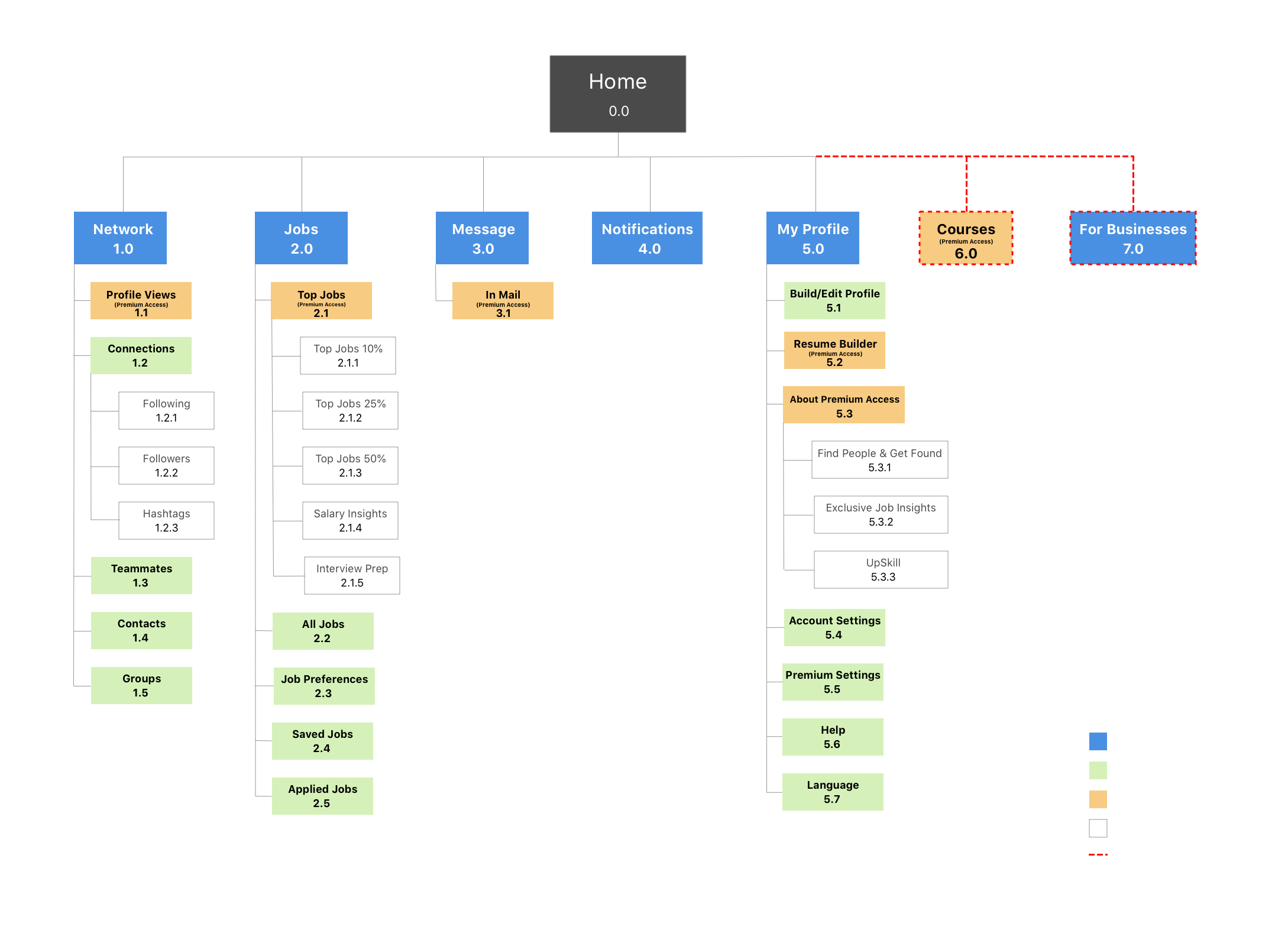
The process started with getting quick user feedback through user interviews. Then, I made a content inventory of the existing LinkedIn site to understand the information hierarchy of the website. I figured the content placement and grouping and identified the content that is deeply rooted.
Next, I conducted hybrid card sorting exercises using Optimal Sort. Then I created a new sitemap and shortlisted 2 core tasks to test. I conducted tree testing to validate navigation and ended with the Chalkmark test (first click test) to evaluate the discoverability of the new sitemap and IA. Finally, I created new navigation flows for the two tasks.